Accessible Color Palette for Data Visualizations
Problem Statement
We need accessible ways of viewing chart data.
Introduction
As part of a project where we built a new set of data visualizations from scratch, we needed a way to define the different values. To be accessible for both sighted and visually impaired users, can we use a standard color palette? Do we need to have patters? A key? Let’s test some of our assumptions and see what users have to say.
Project Details
Client Wells Fargo Commercial
Timeline 3 months
Contribution Lead UX Designer and Brand Representative
Step 1 – Explore palette options
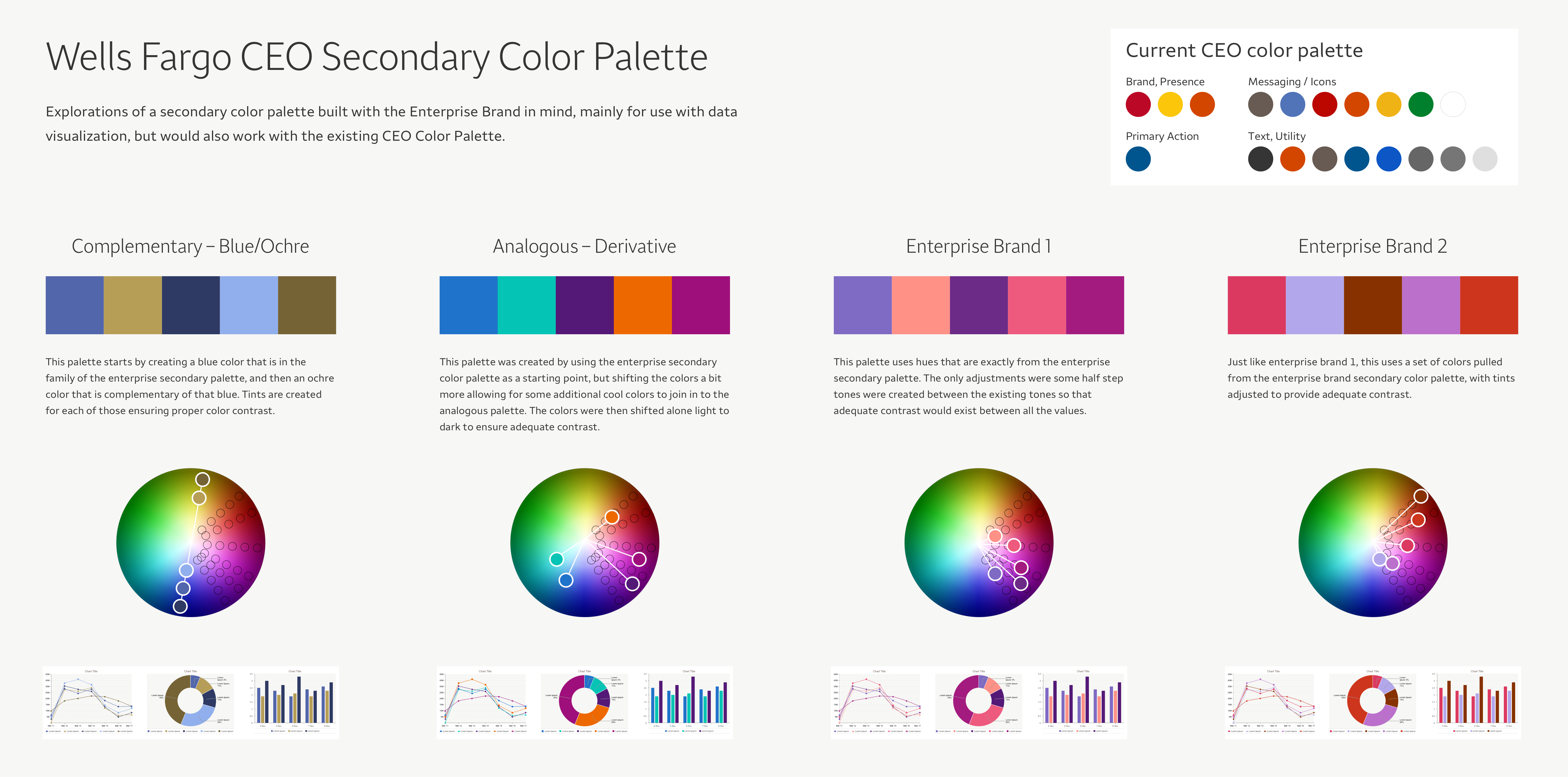
The first step was to come up with a couple be base palette options that all used the original corporate color palette as a starting point.
Step 2 – Test with users
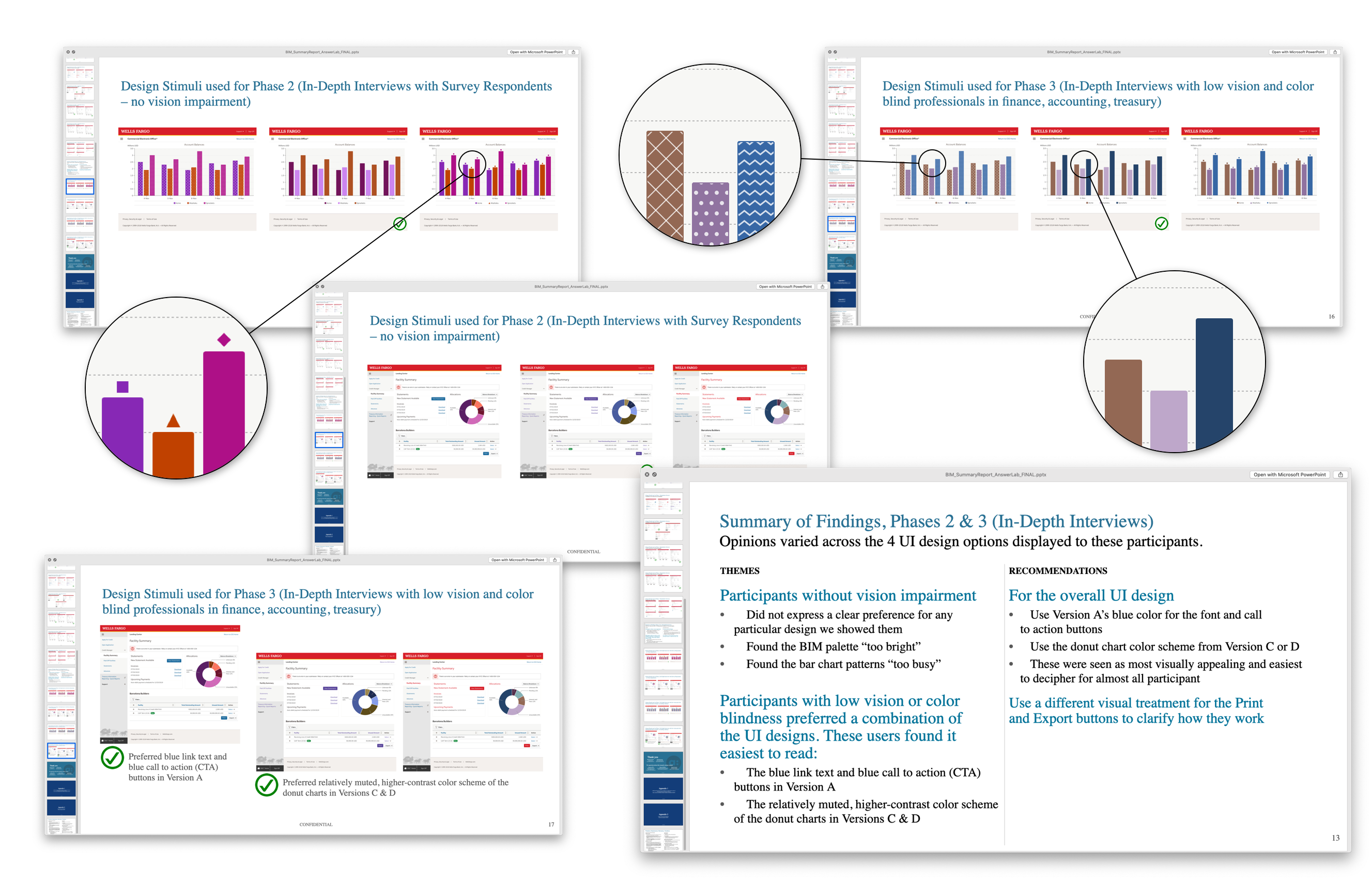
We were very fortunate to not only be able to test these colors with users, but work with an outside user testing agency to conduct a test that not only included people with normal site, but also those with vision impairment (both color blind, and near-blind).
We tested two things. One being the color palette itself, but then also the assumption that to have an accessible data visualization needed to have patterns. We also included a couple other concepts, one using a legend, and the other just having significant contrast.
We were both surprised and pleased to find that not only did both sighted and visually impaired users not like the patterns, but they all preferred the version with contrast. So knowing this, as well as the color palette people preferred, we could move forward with finalizing the palette.
Step 3 – Finalize the palette
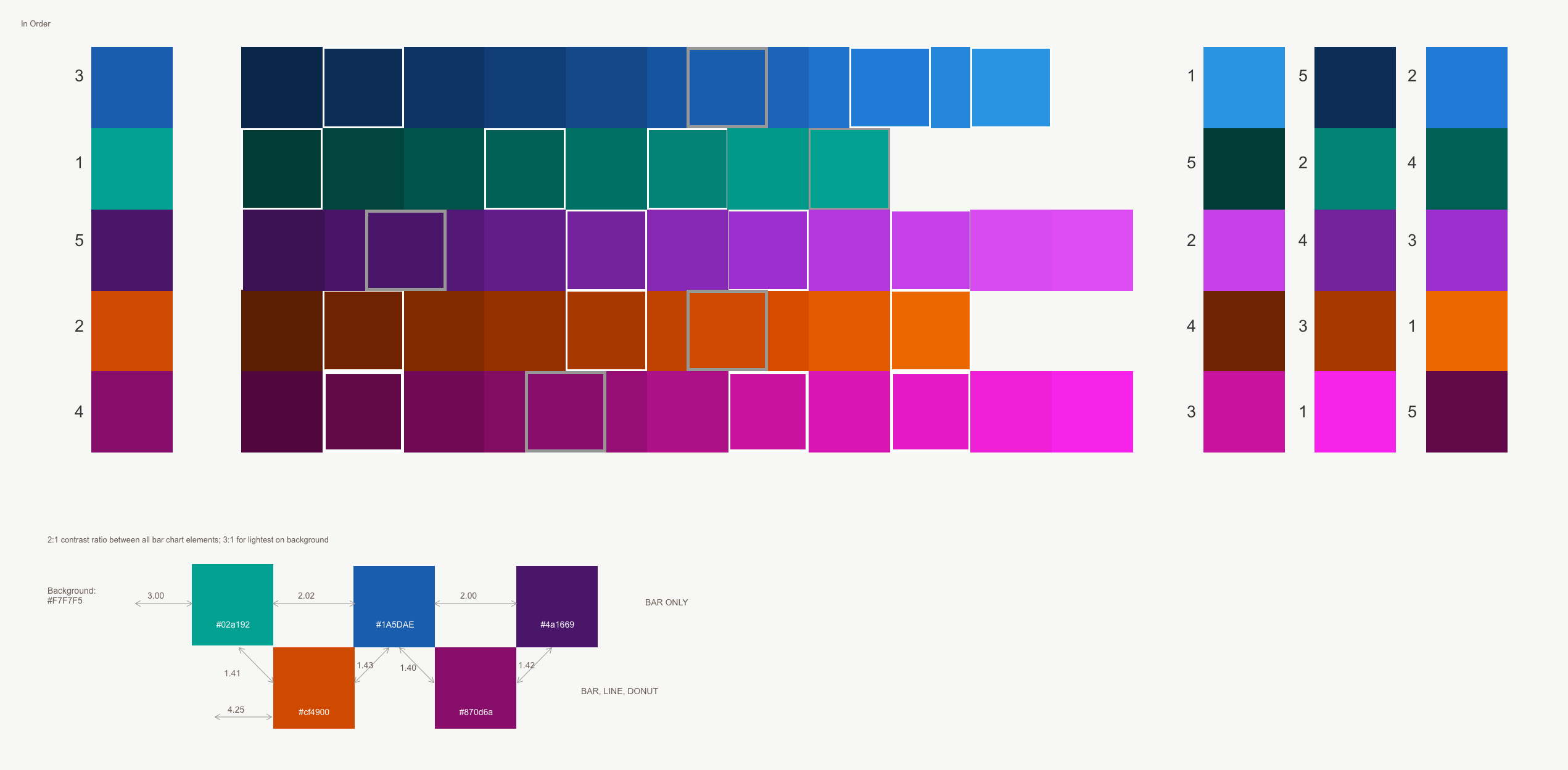
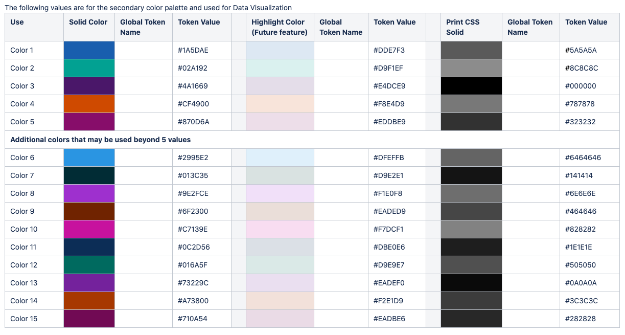
So now that we know a direction of wanting colors that have enough contrast between each other (we went with a 2:1 minimum ratio), and we know what our core colors are, and we know we need 5 default colors, with a possible 20 colors total. Taking this information, we were able to rotate the colors as well as the contrast so that each color has the most amount of contrast to the color next to it. We were able to do this by defining that the order of the colors would always be set (ie, a bar chart with one bar would always have color 1, and so on). We were also able to define an alternate set of Print CSS colors in grayscale, as we know a majority of our users have printers where color isn’t available.
Conclusion
Our initial assumption was that we needed patterns to be accessible. But what we learned was that even visually impaired users thought that looked unprofessional. So instead we could modulate from the corporate retail brand colors and come up with a new commercial palette that was both accessible by using a variation of hues and brightness as well as had brand approval.


