CEO Portal Visioning
Problem Statement
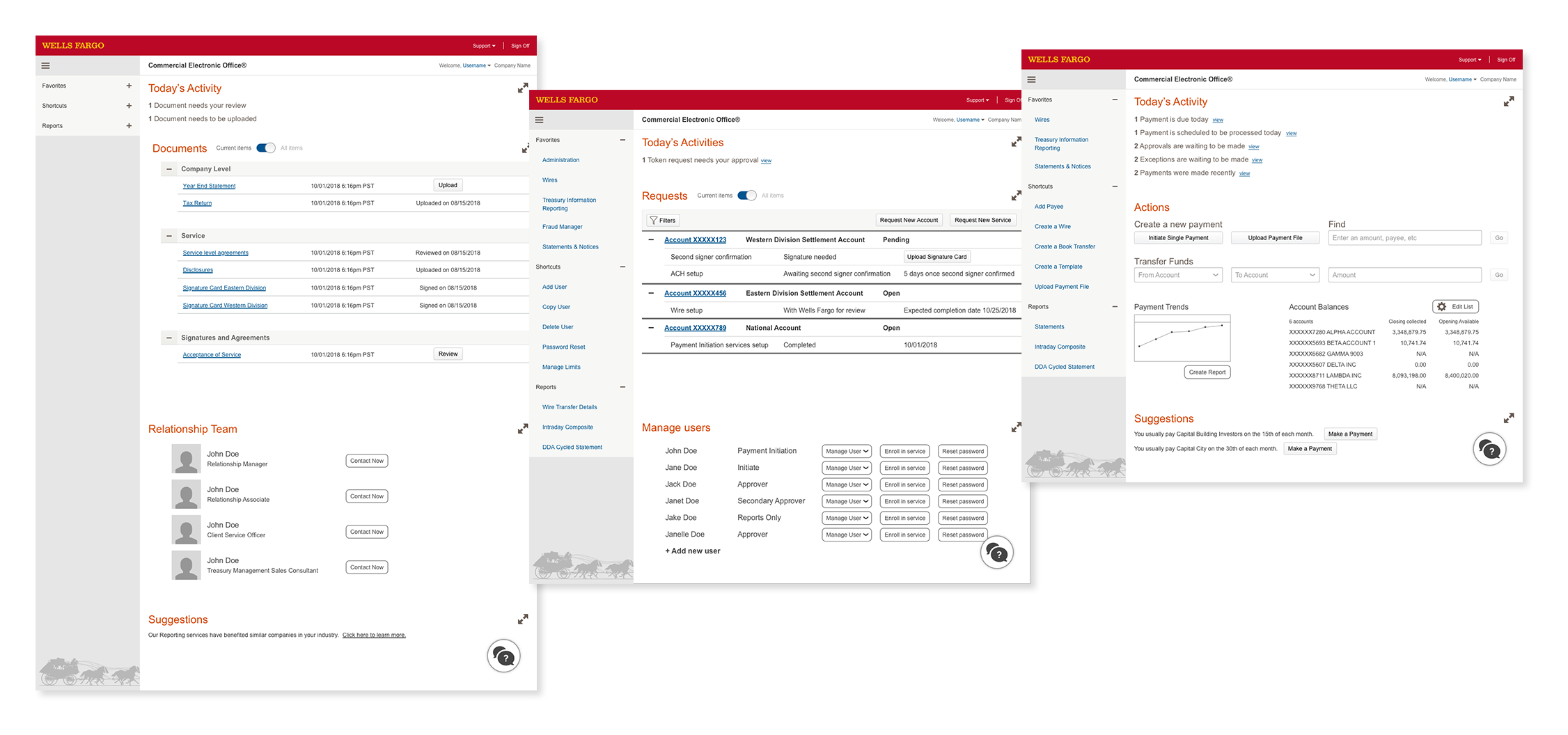
To create screens for an POC that overhauls our core product to present to corporate executives to request $21 Million for a 2 year initiative.
Introduction
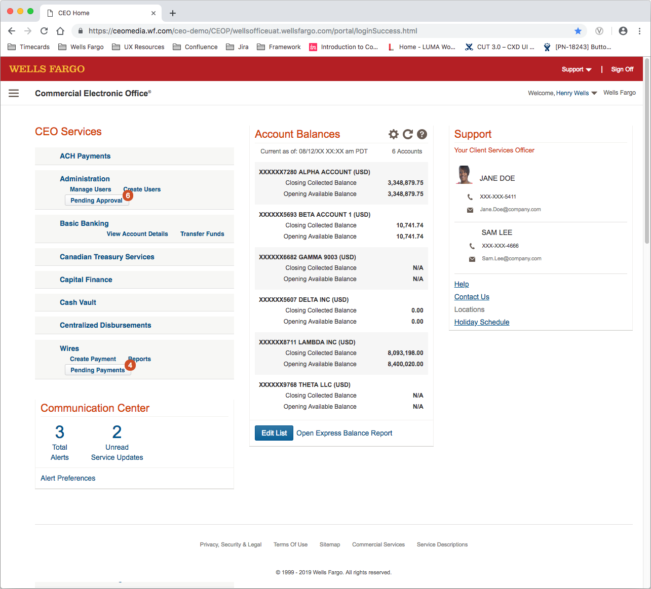
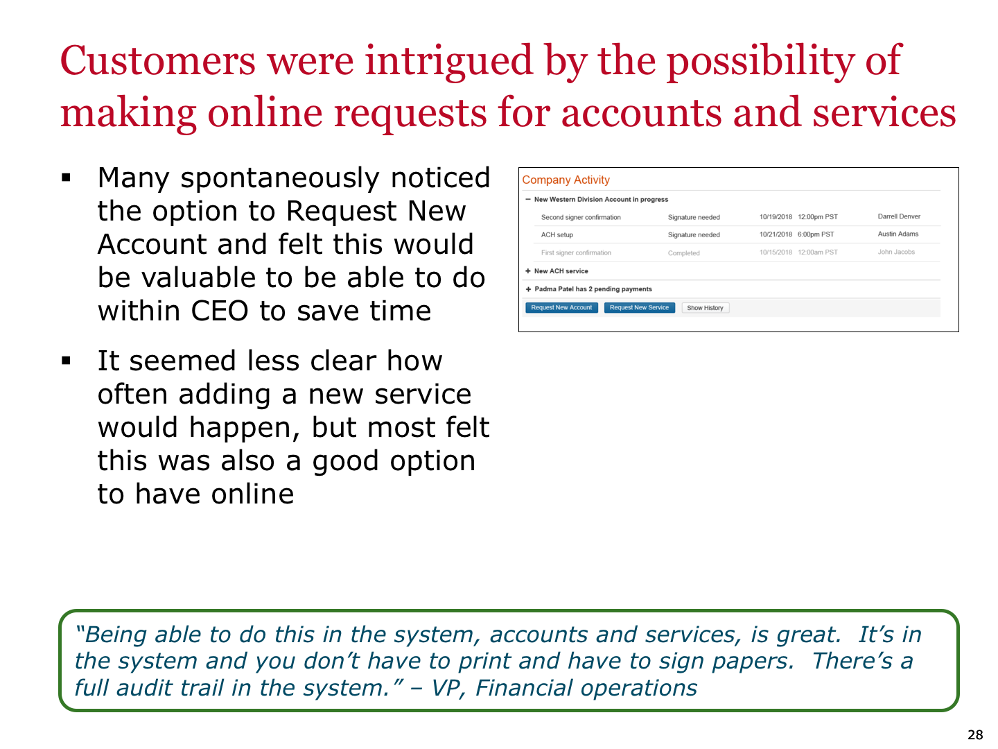
Our current landing screen of our core product, Commercial Electronic Office, is very dated and has a hub and spoke model inherited from when the product was a suite of products. This needs to be updated so that the landing screen is not just a launching screen, but has information and tasks relevant to the things that user frequently does.
NOTE: Right clicking on an image below and selecting “open image in new tab” will bypass opening the image in the lightbox and allow zooming into full detail.
Project Details
Client Wells Fargo Commercial
Timeline 2 Weeks
Contribution Sole UX designer working with 1 producer
Day 0: Defining the problem statement
The landing screen of the Commercial Electronic Office, a Wells Fargo commercial banking application, is not as useful as it could be. Information is hidden, and users have to dig for relevant information, and in addition, launch specific sub applications to do specific tasks, and those applications often do not talk with each other.
Additional early work also included competitive analysis of what other companies have for similar applications, as well as past re-design explorations that have been done by other teams.
Existing landing screen >
Day 1: The users and their story
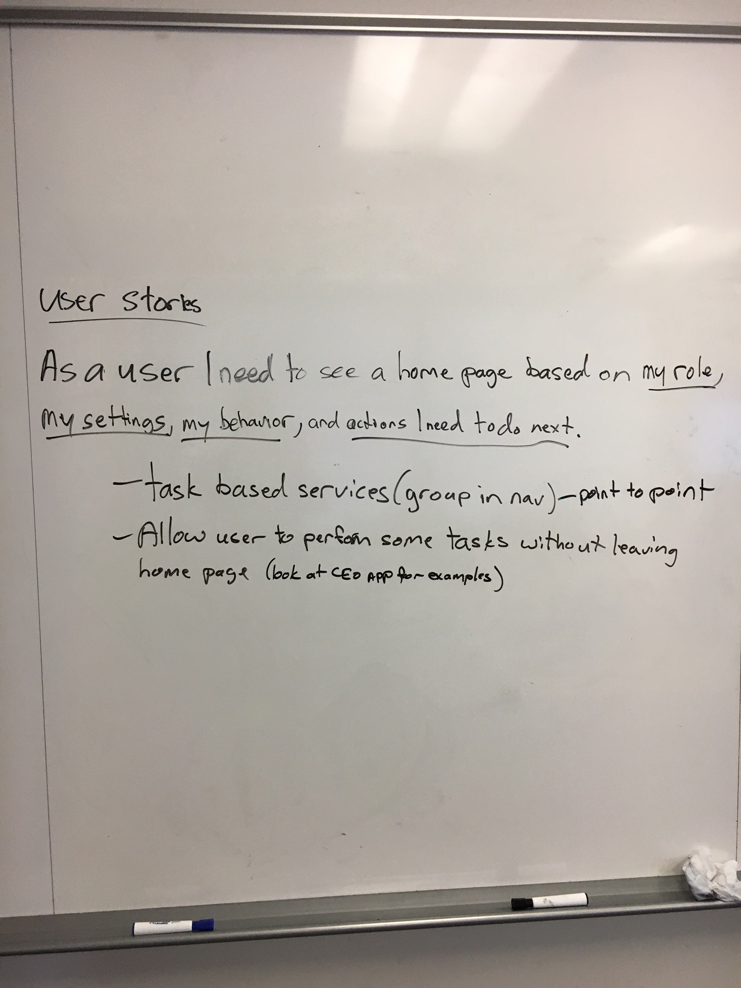
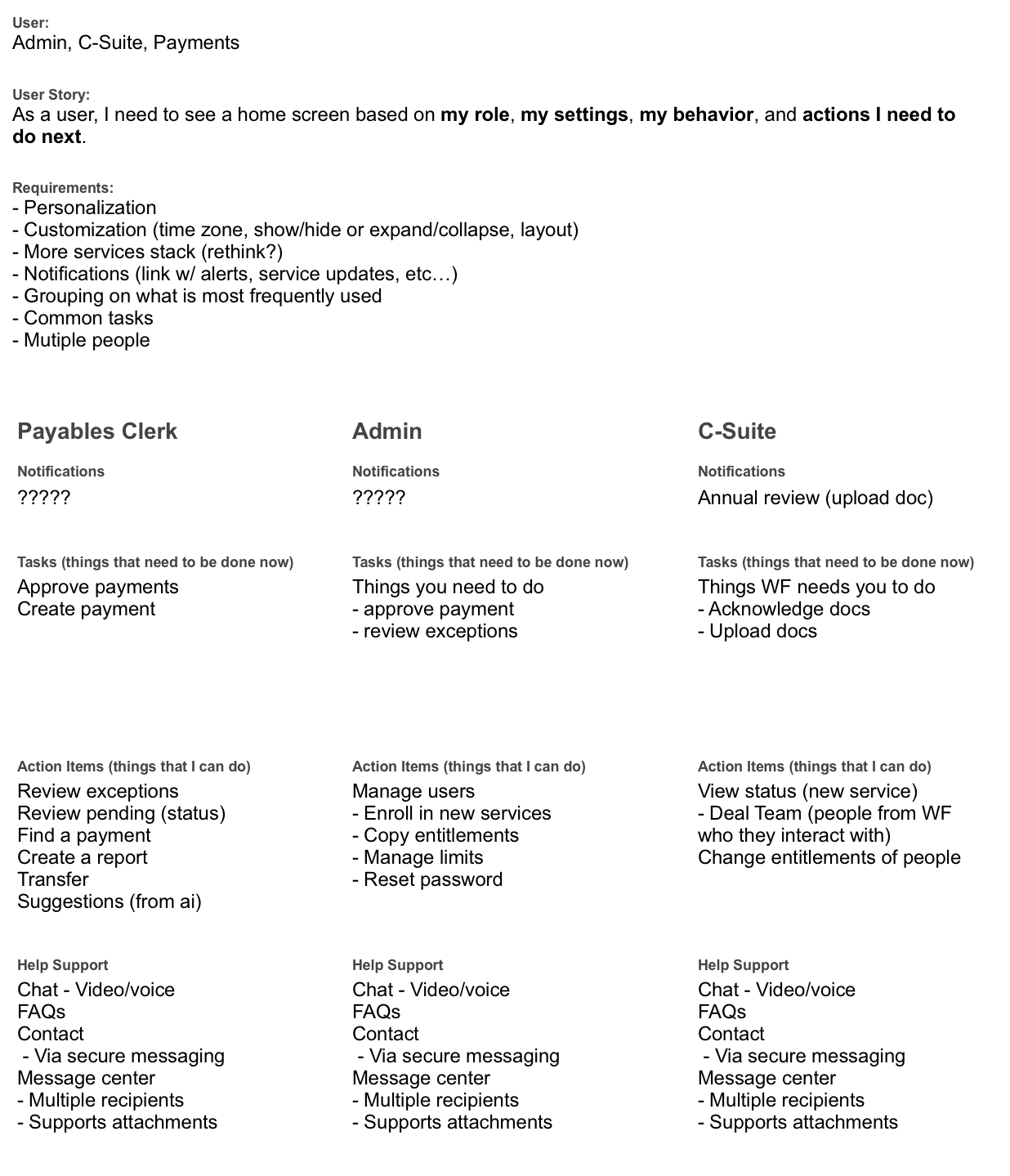
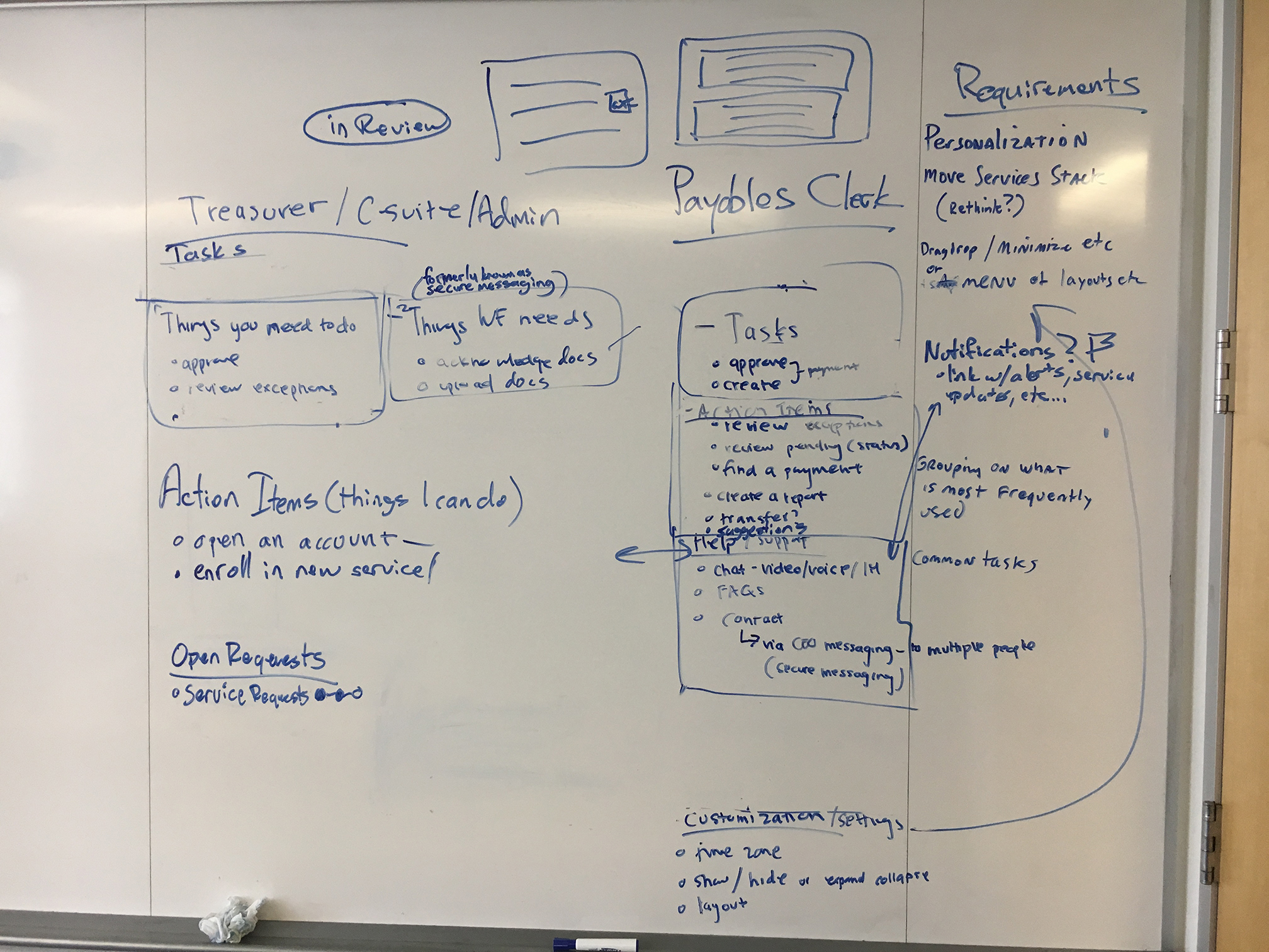
So how do we know what to create? The first step, define the user, and write a user story for that users.
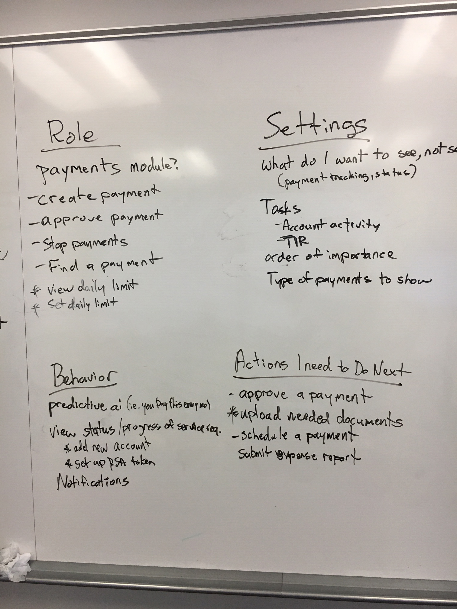
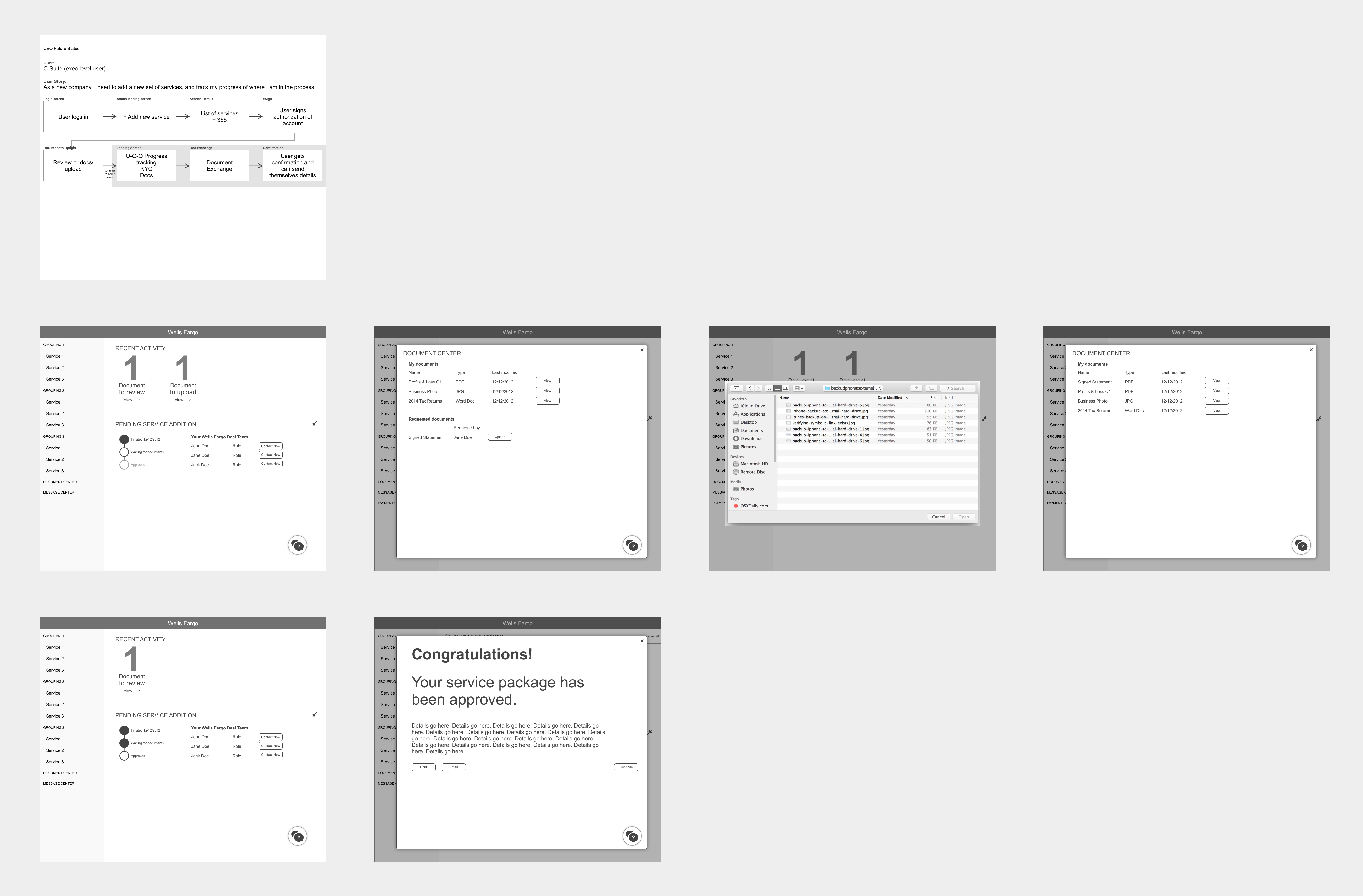
We started with defining the user, and white boarding out a user story, and then breaking down that story into more detail.
Day 2: The user’s journey
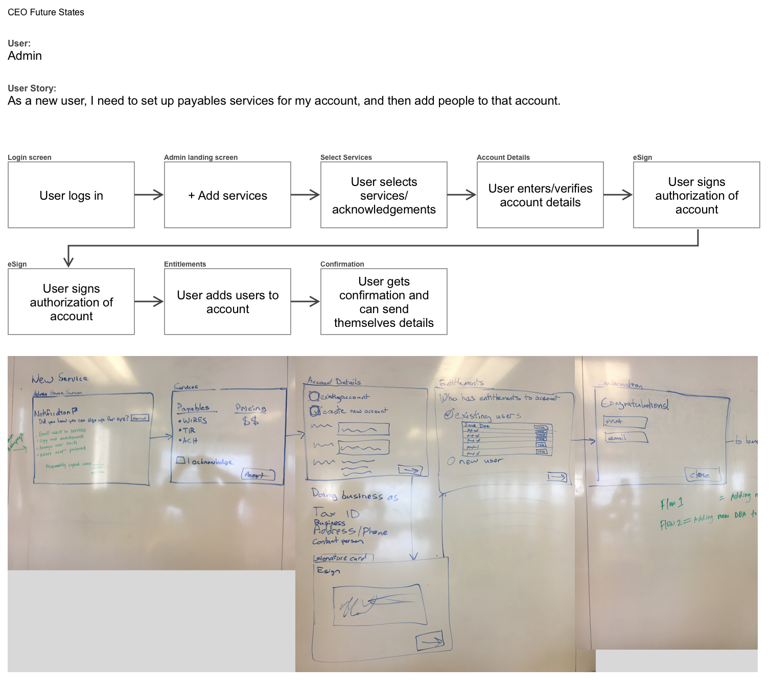
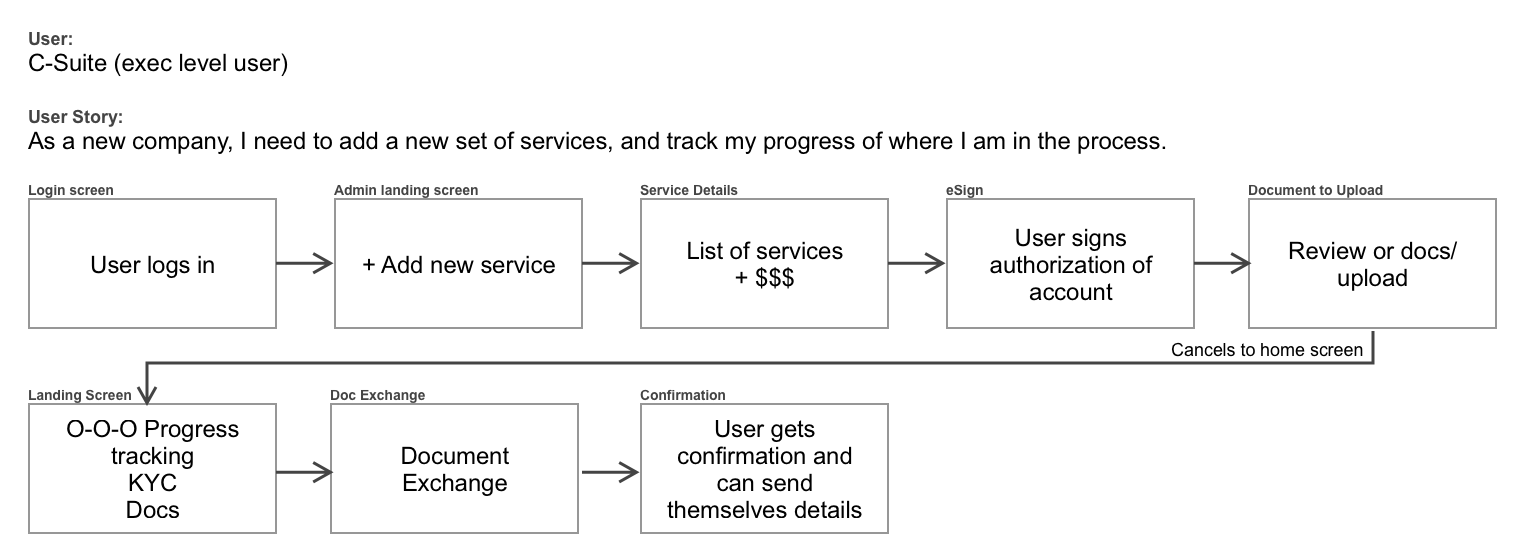
Ok, so in our initial explorations we decided that we want to have a home screen that is useful to the user based on their role. But, we know that different users have different roles at a company, and thus, may have a completely different use of our product.
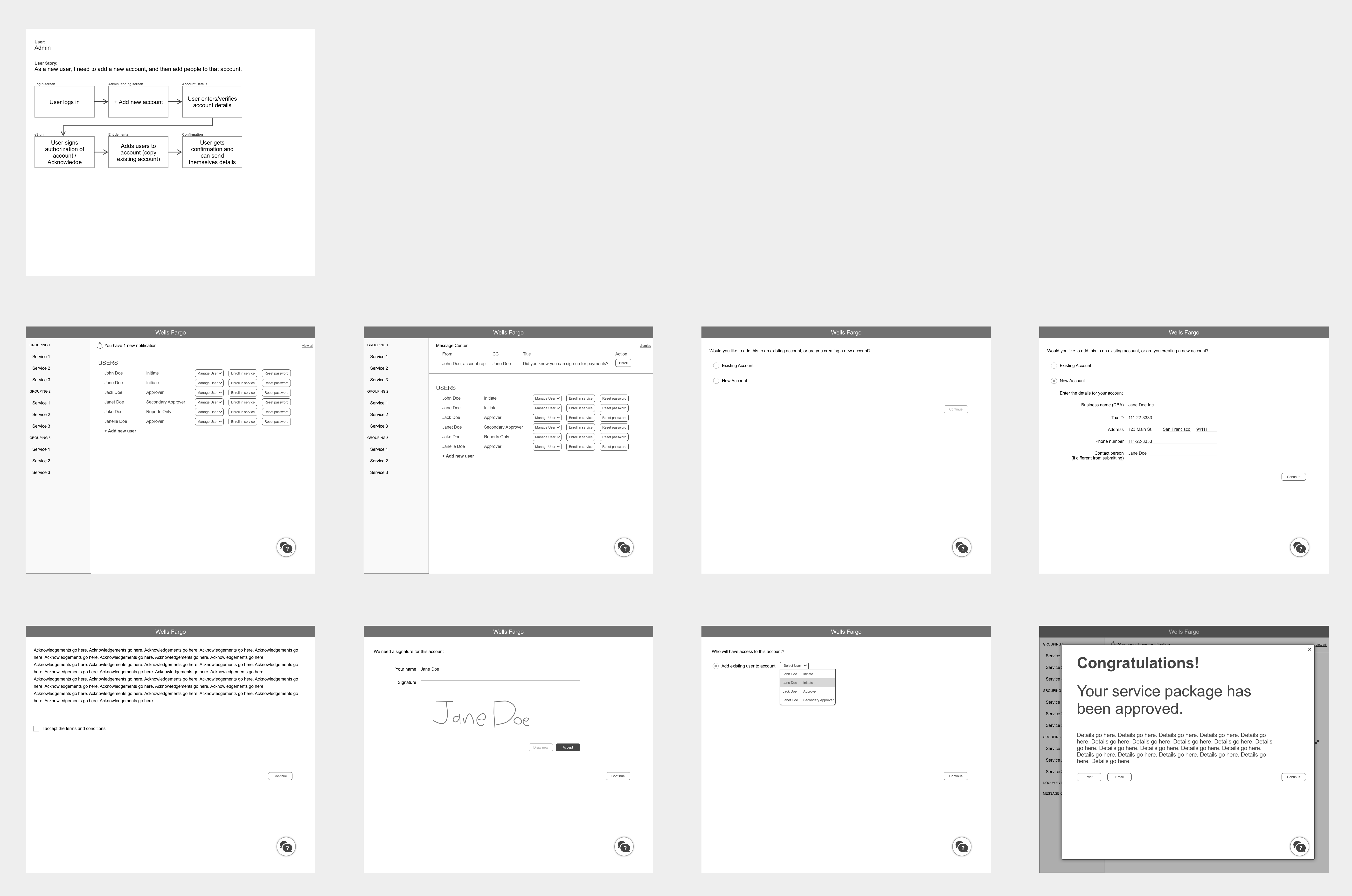
We have a good idea from our previous session who those major users are, so let’s take several of those users and re-write our user story specifically to them, and one of the first major tasks they would need to accomplish, and the define the steps they would take along their journey.
Day 3: Wireframing the user stories
Now that we know the user, the user story, their journey, and a flow needed to complete that journey, what do the actual screens for each of those steps look like?
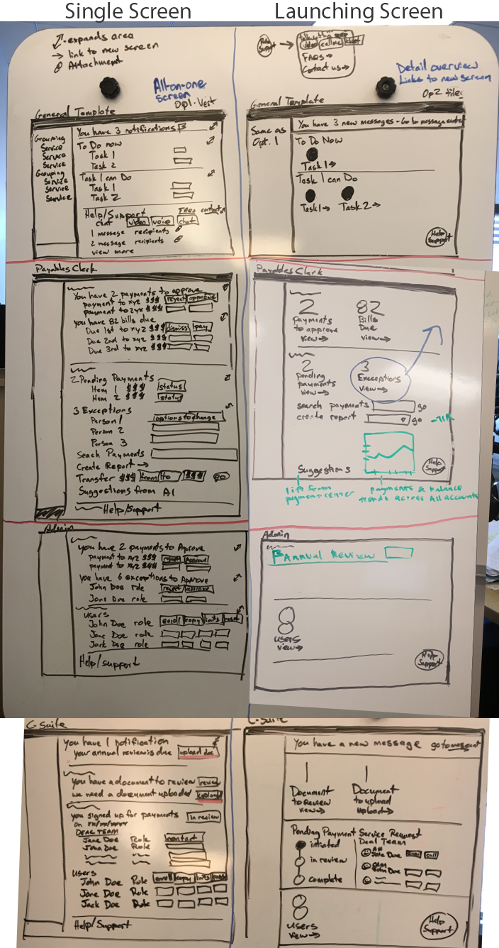
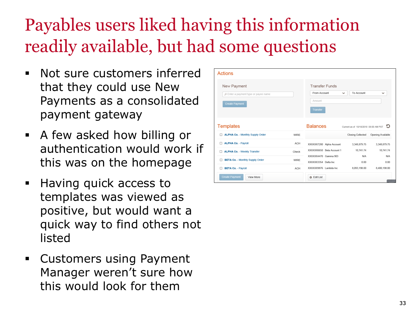
Two options were created for each user story. One, what if the user could do everything from a single landing screen. Two, what if the landing screen was a launching point for each of the tasks the users need to do.
Days 4-5: Wireframing our user story
With a direction chosen by our stakeholders, it was time to create our first round of low fidelity wireframes, and making sure it maps to our user story.
Day 6: Iterate with our product experts
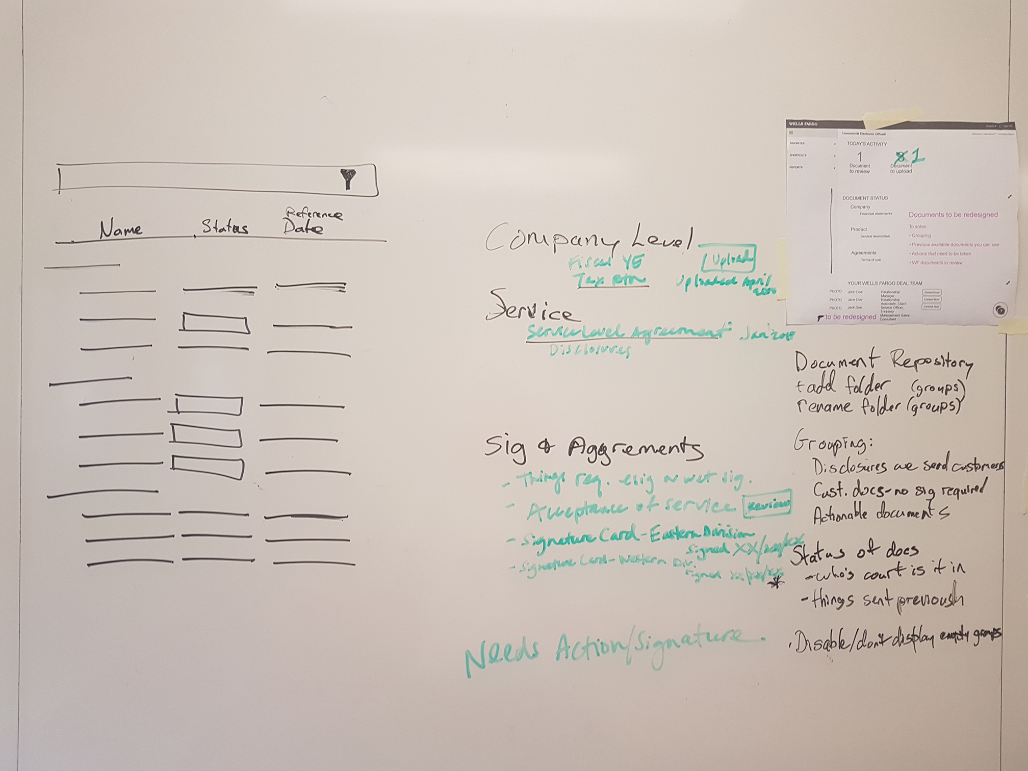
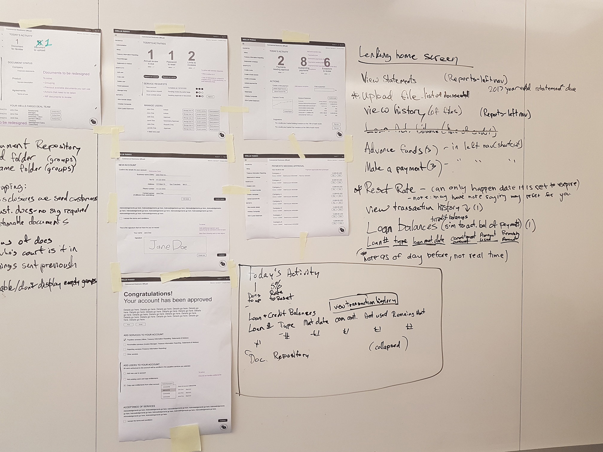
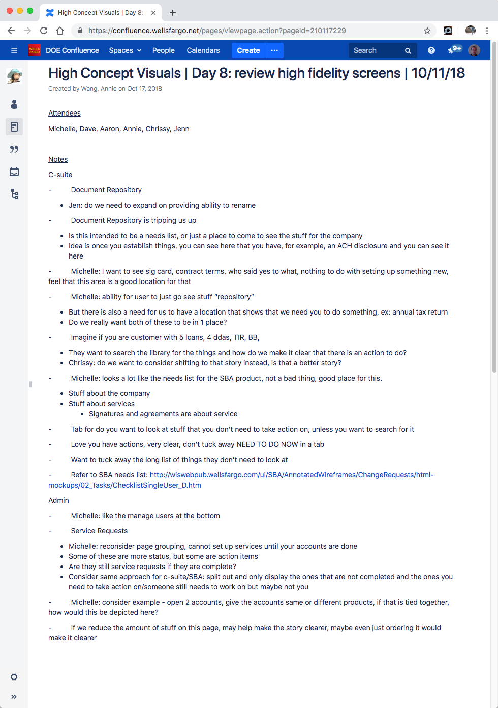
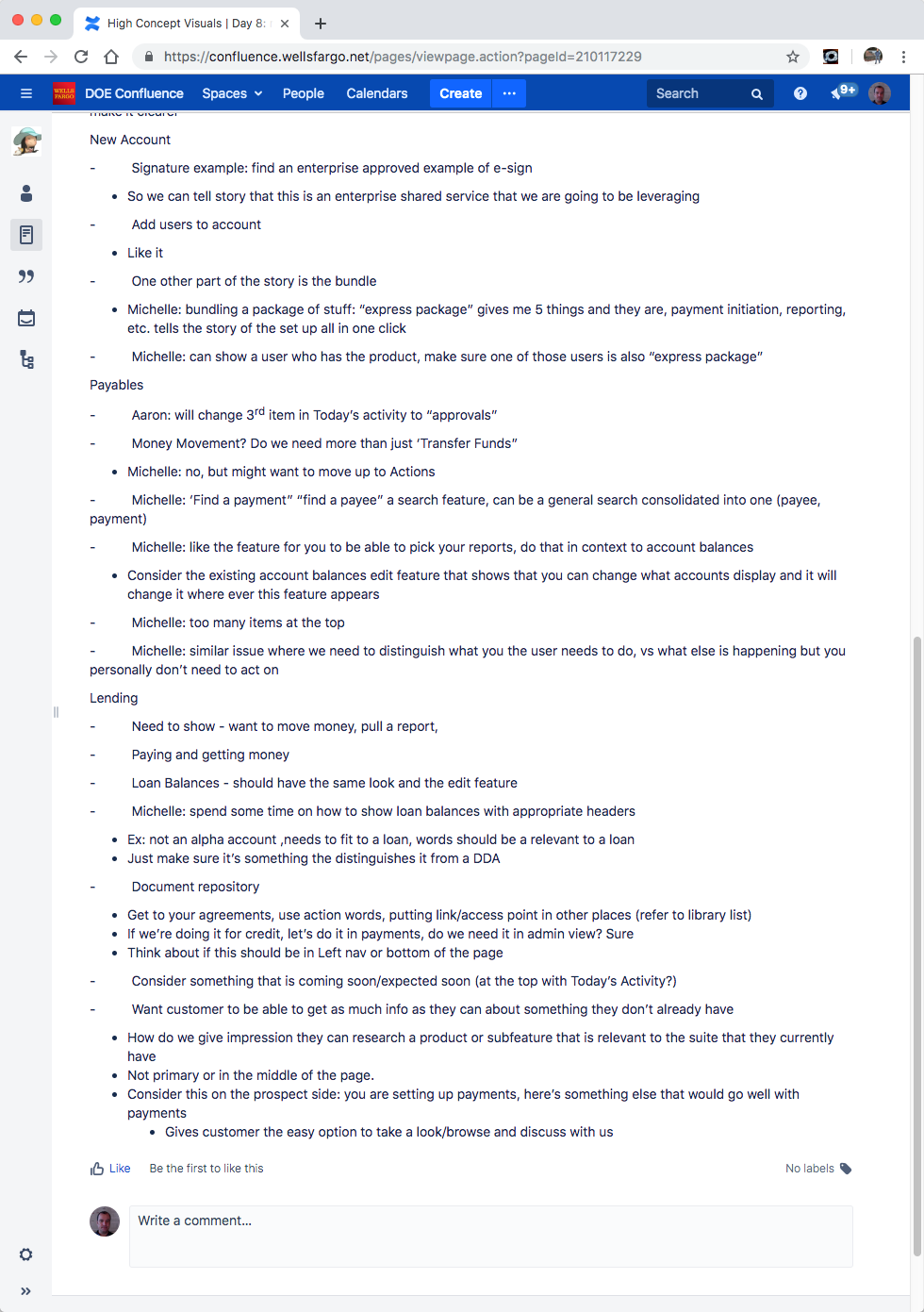
So what are we missing? Here we get all of our product experts into a room, and show them what we have for our screens, go over our initial user journey and all the tasks for each role that we want to make sure to include in this project. All along, discovering essential things to include so that the user can complete their journey.
Days 7-12: Iterate, Iterate, Iterate
From here we had regular check ins with the team and stakeholders, getting their feedback on what is missing, what needs to be included, what is superfluous, what needs to be more prominent and so on.
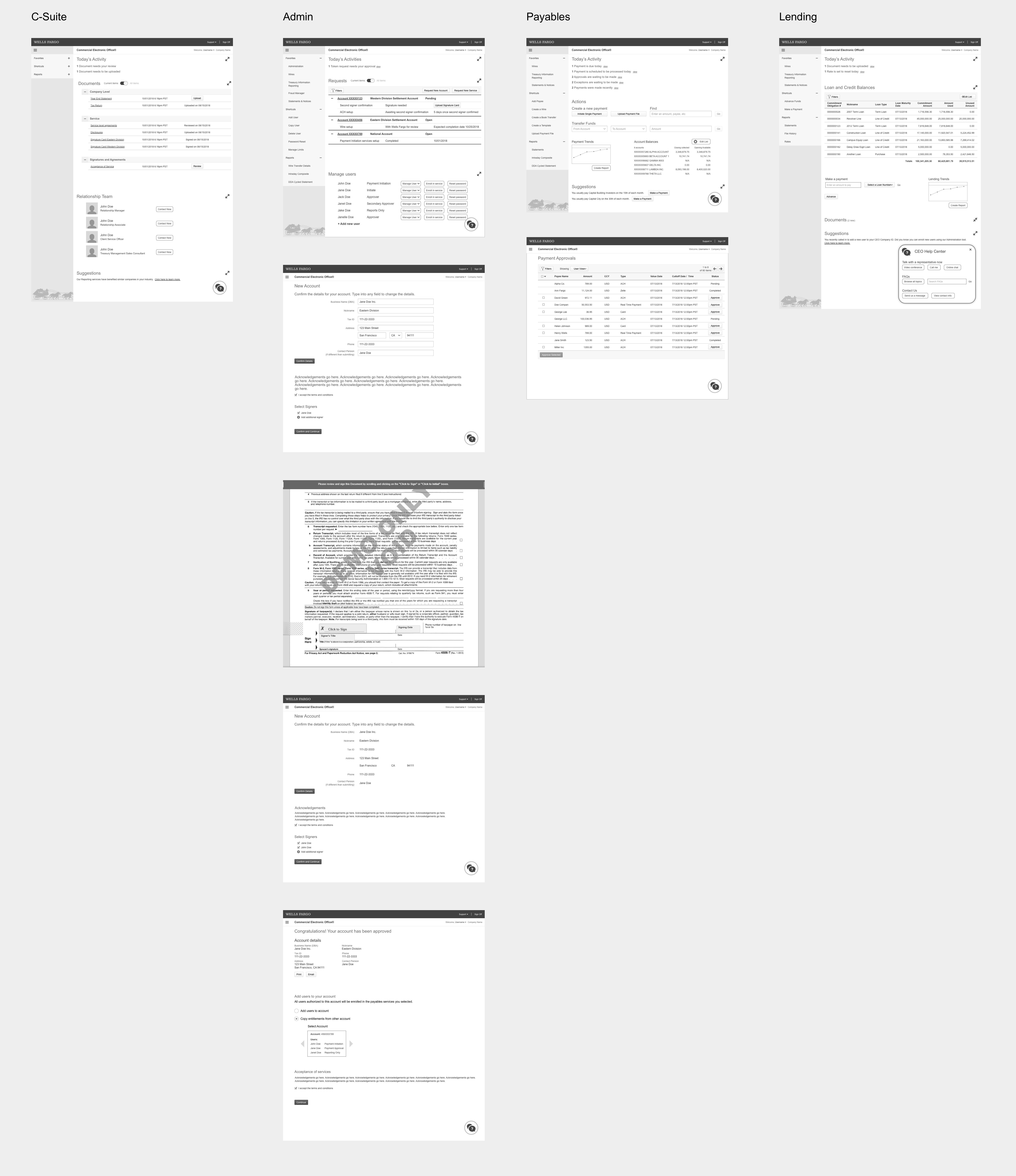
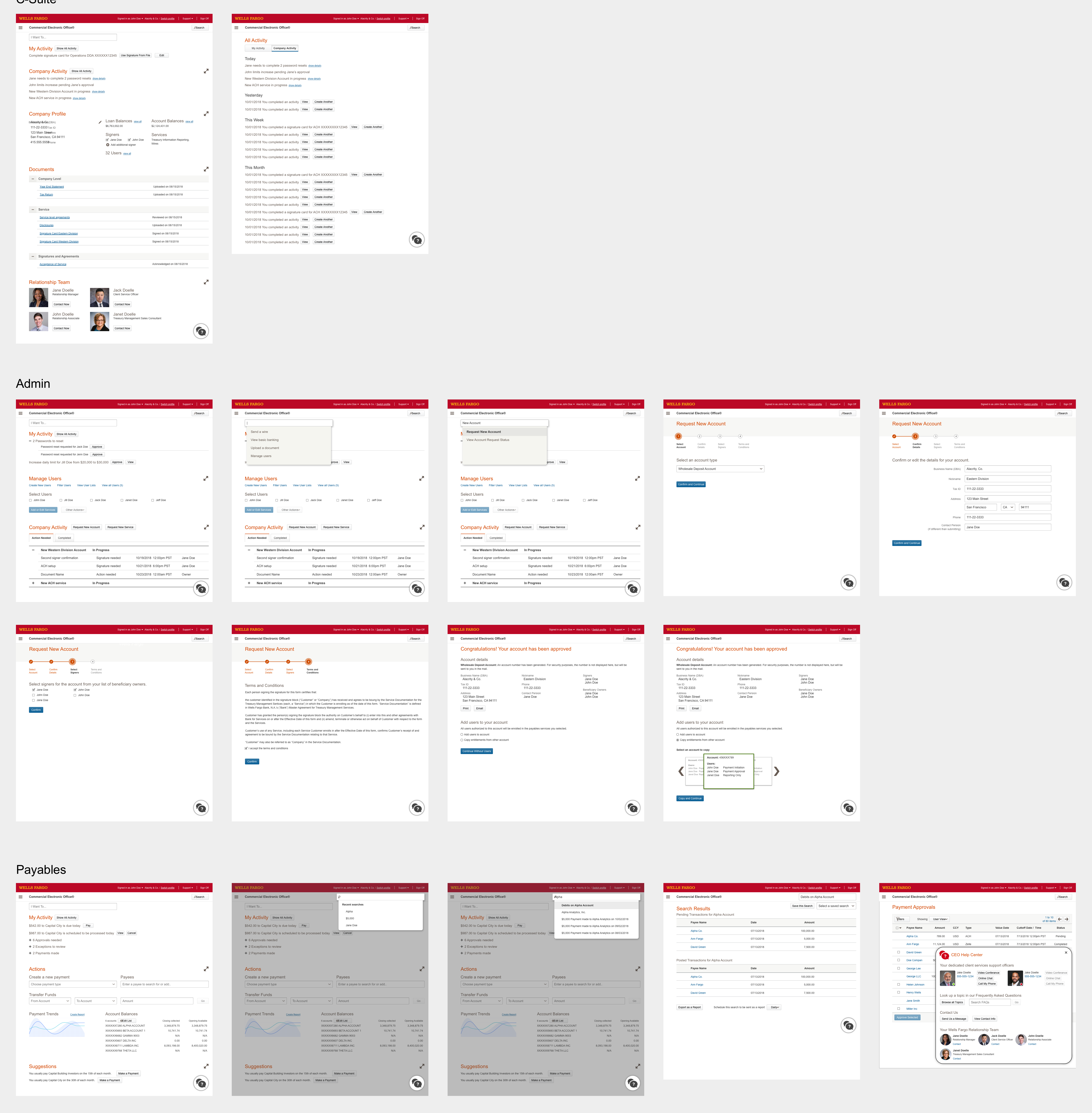
Day 13: Delivering a high fidelity presentation screens & Invision prototype
Time to finalize these wireframes by turning them into high fidelity. Normally in creation of an app, we might create specs, or hand files over to developers in a way that they can know what components to use, what values to use, and all included assets. But in this case, we worked with the head of the Customer Experience Design department to make sure she has an understanding of the flow (also set up in Invision), and could present them in a powerpoint presentation to the company’s top management.
Conclusion
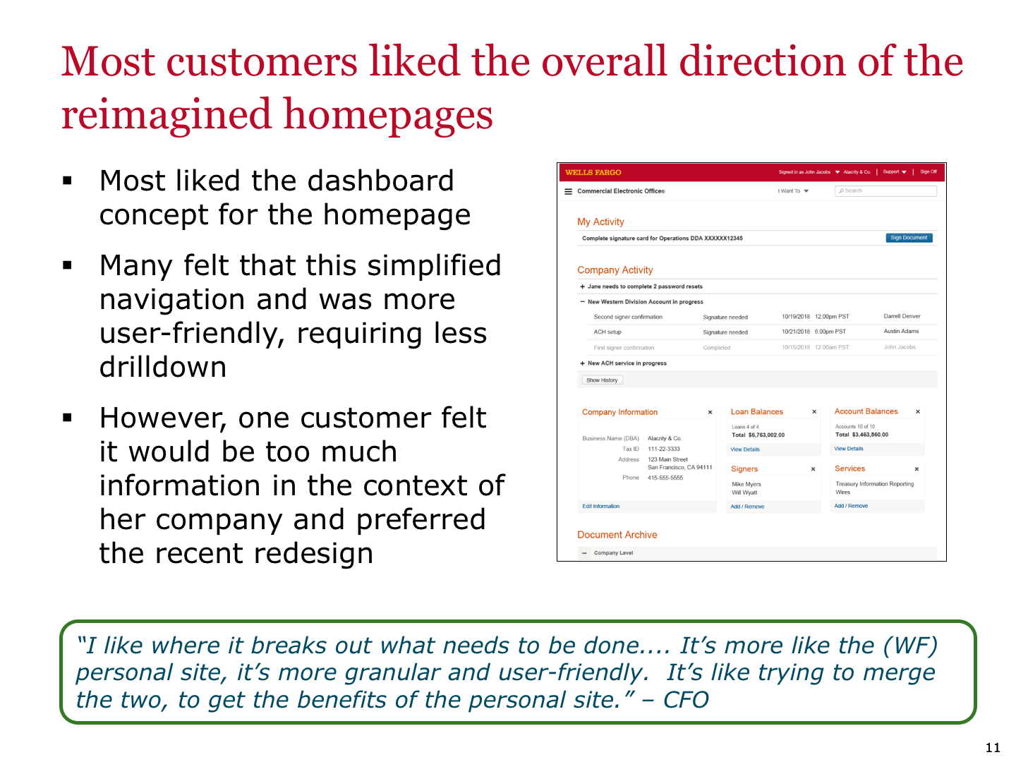
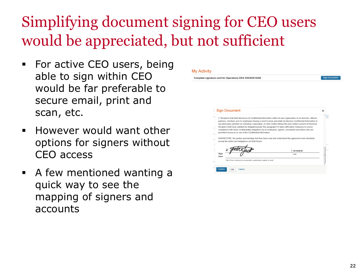
The funding for the project was awarded, and the next step was taking this project to a user test conducted by Wells Fargo’s internal UXR team, and discovering from our users what is working for them, and what isn’t working. From here, the project was passed on to a new team who would be ideating on the concepts and taking it to development.

