Creating a Scalable Design System

Wells Fargo’s Commercial Electronic Office processed over $11 trillion annually — but the design system behind it wasn’t built to scale. Theming required changes at the component level because no global token layer existed. A team of 30 product designers was working from inconsistent base files and inaccurate Sketch libraries, leading to developer confusion and QA failures on every release cycle.
I identified this as a systemic risk and initiated the effort to fix it. Over two years, I led the design system from a single-application component library to a themeable, token-based platform — adopted by the core product team and positioned for use across internal corporate applications at the bank.
Project Details
Client Wells Fargo Commercial
Timeline 2 Years (ongoing)
My Role Key Instigator / Lead UX Designer, Design Systems
Team ~30 product designers, engineering, QA
My Contribution Initiated the project; sole designer responsible for token architecture, toolkit design, documentation restructure, and cross-functional alignment across design, engineering, and QA.
Defining the problem
Current Blockers
Before proposing a solution, I mapped the specific blockers preventing scale. Working with product leadership, I identified four root causes:
- The design system was architected for a single application — no abstraction existed for cross-app use
- Theming required component-level edits because no global token layer existed
- Designers didn’t have a reliable source of truth for components, so they were creating their own specs — which conflicted with the code and confused developers
- Base Sketch files were inconsistent across the team, leading to inaccurate designs that failed QA
These weren’t separate problems. They shared a root: the system had never been designed with scale in mind.
Steps to resolve
The fix required work at four levels: component architecture, token layer, documentation, and tooling. I defined the scope and sequenced the work:
- Map nested component relationships to eliminate redundant specs and reduce design debt
- Define and implement global tokens based on atomic design — aligned between design, code, and brand
- Expose component-level tokens selectively, so theming is controlled without opening the full system
- Build a design toolkit that mirrors the code, so designers and developers are working from the same source of truth

Component architecture and documentation
Identifying atomic design to nested components
The first step was understanding how components related to each other — which atoms made up which molecules, and how values cascaded. This was foundational: without a clear map of nesting relationships, changing a token value at the wrong level would produce unpredictable results across the system.
I worked through the full component inventory and documented every nesting relationship. This also revealed where the documentation had accumulated technical debt: any place a nested component appeared in a spec, past designers had fully re-specced it from scratch rather than referencing the component. Every one of those was a potential source of developer confusion.

Nested styles in our framework

Unthemed
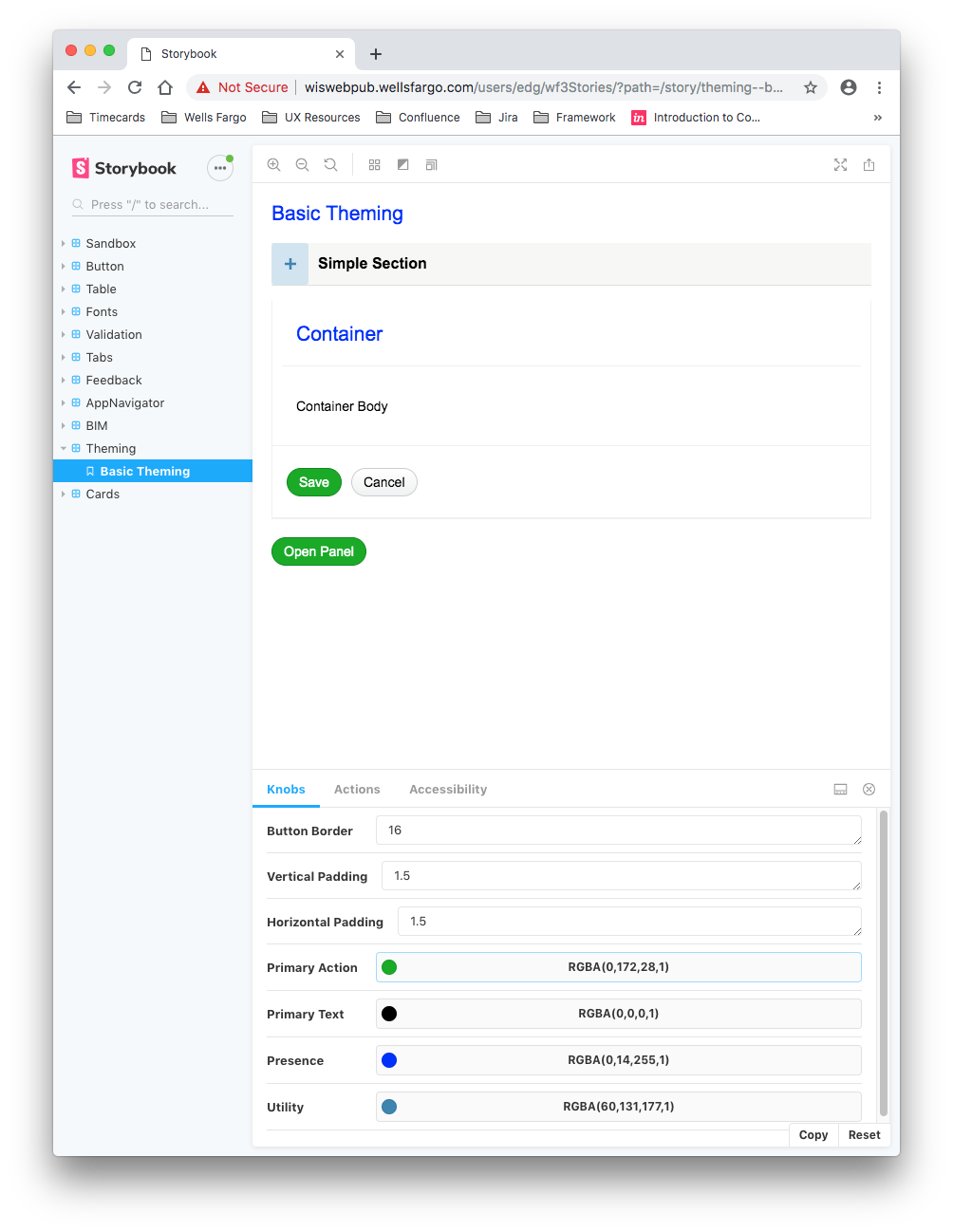
Proof of concept: Storybook (code)
To get design and business buy-in on the direction, I had a developer build a quick Storybook proof of concept showing a component rendering in two themes by swapping token values. Seeing it work in code — rather than in a static mock — made the approach concrete and accelerated stakeholder alignment.
Rethemed

Speccing nested elements
Cleaning up our documentation
Once the nested component map existed, I restructured the documentation. Any time a nested component appeared in a spec, I replaced the duplicated absolute values with a reference to the component itself — naming which component it was, which props applied, and calling out CSS only when there was an actual override.
This eliminated a significant source of developer confusion: previously, a developer looking at a spec for a table couldn’t tell if the button inside it was supposed to match the button spec or the values in the table spec. After the restructure, the answer was always: match the component, apply the listed props.
Token layer
Audit of existing tokens
Tokens existed on the engineering side, but they had been defined by developers in isolation — no design or brand input, no semantic naming, and no alignment between what design was specifying and what code was using. I initiated the first cross-functional token alignment at Wells Fargo Commercial.
Starting from the existing codebase, I audited every token, identified what should become a global token, renamed values from color-based naming (e.g. blue-500) to semantic, use-based naming (e.g. color-action-primary), and documented what to deprecate, what to rename, and what to add net-new.

Token documentation


Identifying our global color palette
The existing color palette was roughly 10 years old. It had never been formally documented — some colors had fallen out of use, others had been added ad hoc, none of it was reconciled with the brand. I went through and established the canonical set of values that would become the global color tokens.
This process was then repeated for typography, border thickness, border radius, and drop shadows. Spacing was scoped to a later phase.
Implementation by design, development, and QA
Token adoption required solving three different needs simultaneously. Designers needed to reference tokens in Sketch. Developers needed tokens in their specs so they could implement using the right variable names. QA was running validation against post-build code and comparing to design specs — but they were seeing hex values, not tokens, which broke their process.
The solution: I authored tokens as Confluence excerpts that could be included anywhere a token was specced for developers. This meant QA could validate against token names rather than hex values, and the spec became the single source of truth across all three disciplines.


Socializing the new system
Releasing a new token layer inside a large organization creates an adoption problem. Teams that had never worked directly with our design system needed to understand what existed, what had changed, and why they should adopt it. I created a set of digital posters for circulation across internal platforms — designed to explain the system to teams we might never directly interact with.
Design toolkit
Creating a design kit to be used by all design
With the token layer defined, the next dependency was a design kit that matched the code. Without it, designers would continue working from outdated or self-made files — and every token alignment I had done on the engineering side would fail to materialize in actual design deliverables.
There was no single source of truth for the team of 30 product designers. Work typically started by grabbing an old Sketch file from a previous project, or from a designer’s personal library. The gap between those files and the production codebase was the root cause of most developer handoff failures and QA rejections.
I built the kit from scratch — matched to the code, with built-in spacing for components and nested components, and every React prop and method surfaced as a Sketch symbol override. This started as a self-initiated side project. Once I had demonstrated its value to design leadership, I was able to bring on a contractor to accelerate delivery, and later a second contractor was added to own ongoing maintenance.


Symbols in Sketch File – Screen Templates

Symbols in Sketch File – Buttons Resize

Symbols in Sketch File – Tables with states

Symbols in Sketch File – Symbols

Theme 1 in Sketch POC


Theme 2 in Sketch POC

Proof of concept: Making the toolkit themable
The same token architecture that made the codebase themeable applied directly to the Sketch kit. Once the files were properly structured — components referencing shared library styles rather than hardcoded values — generating a new theme became a configuration exercise rather than a rebuild from scratch.
A Sketch proof of concept demonstrated this: switching the global token values produced a fully re-themed kit without touching a single component file.
Use cases emerge!
Before the project fully launched, two immediate use cases emerged from the themeable architecture:
- Low fidelity toolkit — by applying a simplified token set, the same components could be used for interaction wireframing and low-fidelity prototyping
- Rebrand exploration — design leadership was able to use the toolkit to rapidly explore what a company rebrand would look like across the product, without building new files from scratch
Both use cases were only possible because the system was designed to be scaled — not treated as a one-time deliverable.

Low Fidelity Toolkit – Themed

Tables themed for medium fidelity toolkit

An unthemed example wireframe from our core application

And rethemed!
Conclusion
The design kit was widely adopted across the core product team. The token-aligned codebase began gaining traction for adoption by other internal teams at the bank — the goal the project was designed to enable from the start.
Accessibility compliance came with adoption: the accessibility standards built into our framework extended to any team that used it, without additional effort on their part.
What this work demonstrated is something I’ve carried into every design systems engagement since: a design system is only as valuable as its adoption. Building the components isn’t the job — making them the path of least resistance for design, engineering, and QA is the job.