AI Canvas & Geomap — Designing a Map Widget for Two AI Surfaces
Problem
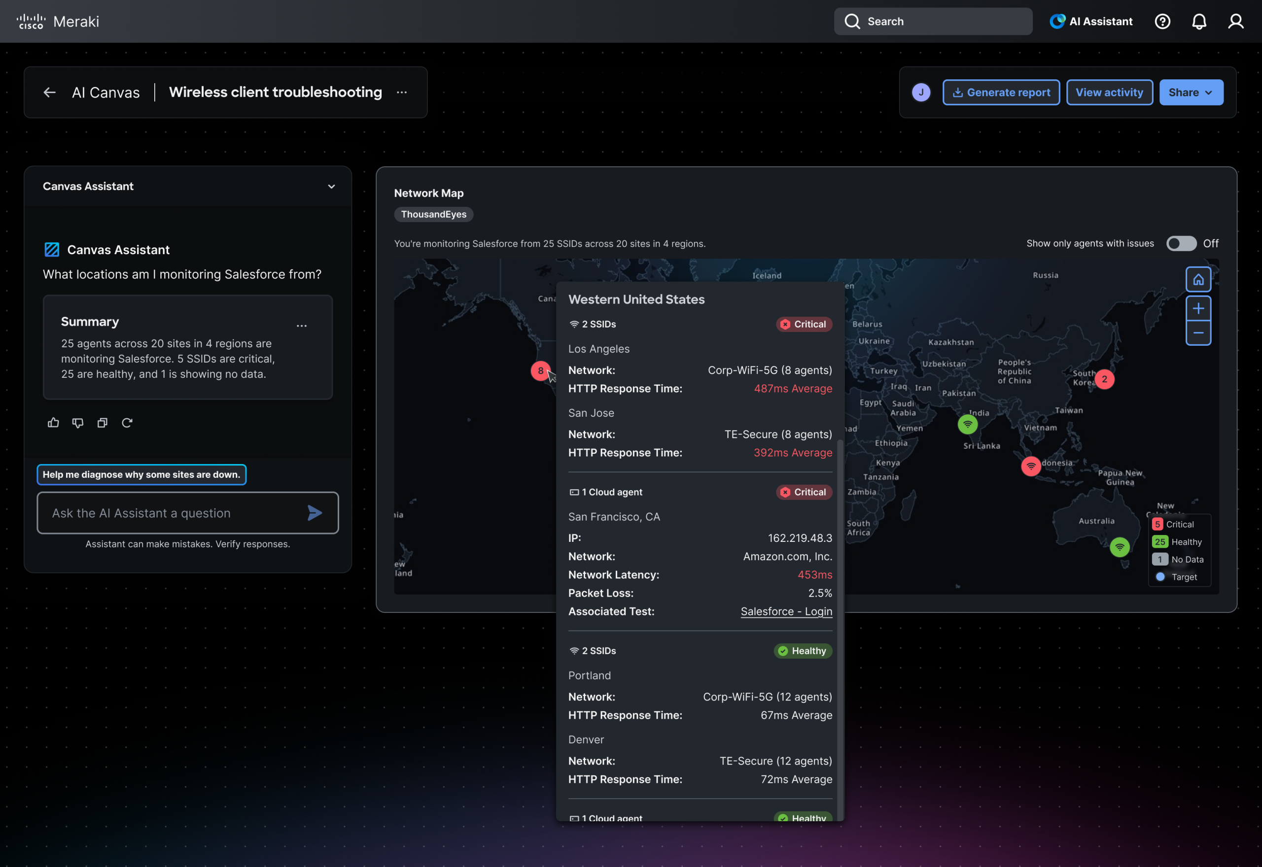
ThousandEyes is building an AI Canvas — an interactive surface where AI-generated widgets answer user prompts about network monitoring. One of those widgets is a map: “What locations am I monitoring Salesforce from?” or “Which offices have Wi-Fi agents with issues?”
The design challenge had three layers.
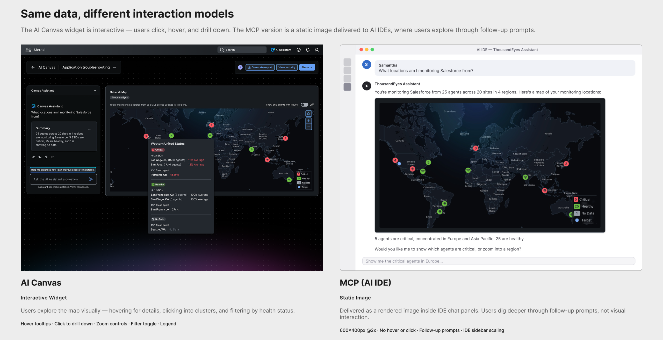
First, the map widget needed to work on two fundamentally different AI delivery surfaces. The AI Canvas version is interactive — users hover for tooltips, click to drill down, and explore visually. The MCP version is delivered as a static image inside AI IDEs like Cursor or Claude, where the interaction model is conversational: users dig deeper through follow-up prompts rather than clicking. Same data, two entirely different relationships between user and information.
Second, the existing geomap component had no dark mode tiles, no custom theming, and no precedent for delivery outside the product UI. The tile work ran in parallel with the widget design — whatever I built would be usable by any team across the product.
Third — and most relevant to the AI delivery context — there was no design language for when an AI model should show a map at all. A model answering a network question could respond with a map, a line chart, a table, or a path visualization. Without explicit rules, it would guess. Designing those rules was as much a design problem as designing the map itself.
Process
Discovery
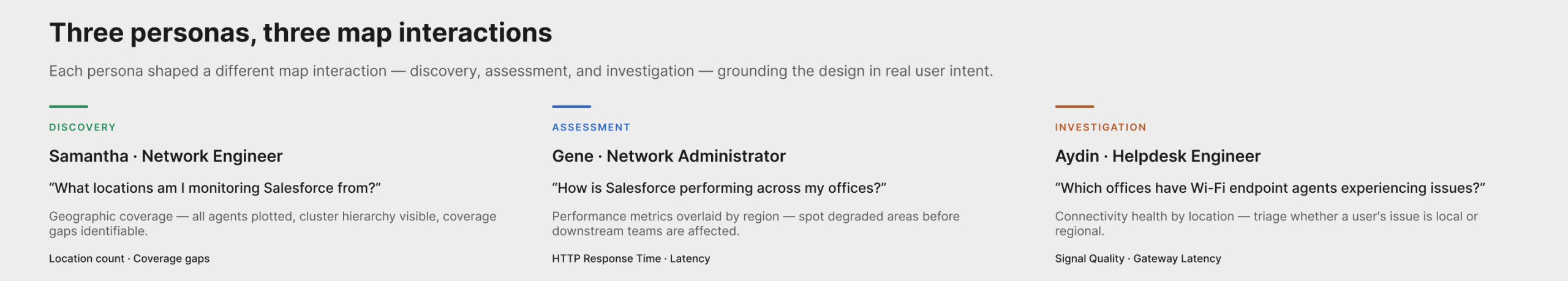
I started from the PRD and translated requirements into persona-based use cases. Samantha, a network engineer, needs to verify geographic coverage. Gene, a network administrator, needs to assess performance across regions. Aydin, a helpdesk engineer, needs to triage connectivity issues by location. Each persona shaped a different map interaction — discovery, assessment, and investigation — which kept the design grounded in real user intent rather than abstract feature lists.
Define
I scoped three parallel workstreams: the widget itself (node types, clustering, tooltips, drill-down hierarchy), the map tiles (integrating MapTiler vector tiles with custom dark-mode styling), and the surfacing schema (the decision rules for the AI model). The tile work and schema work each had independent value beyond this project.
Design
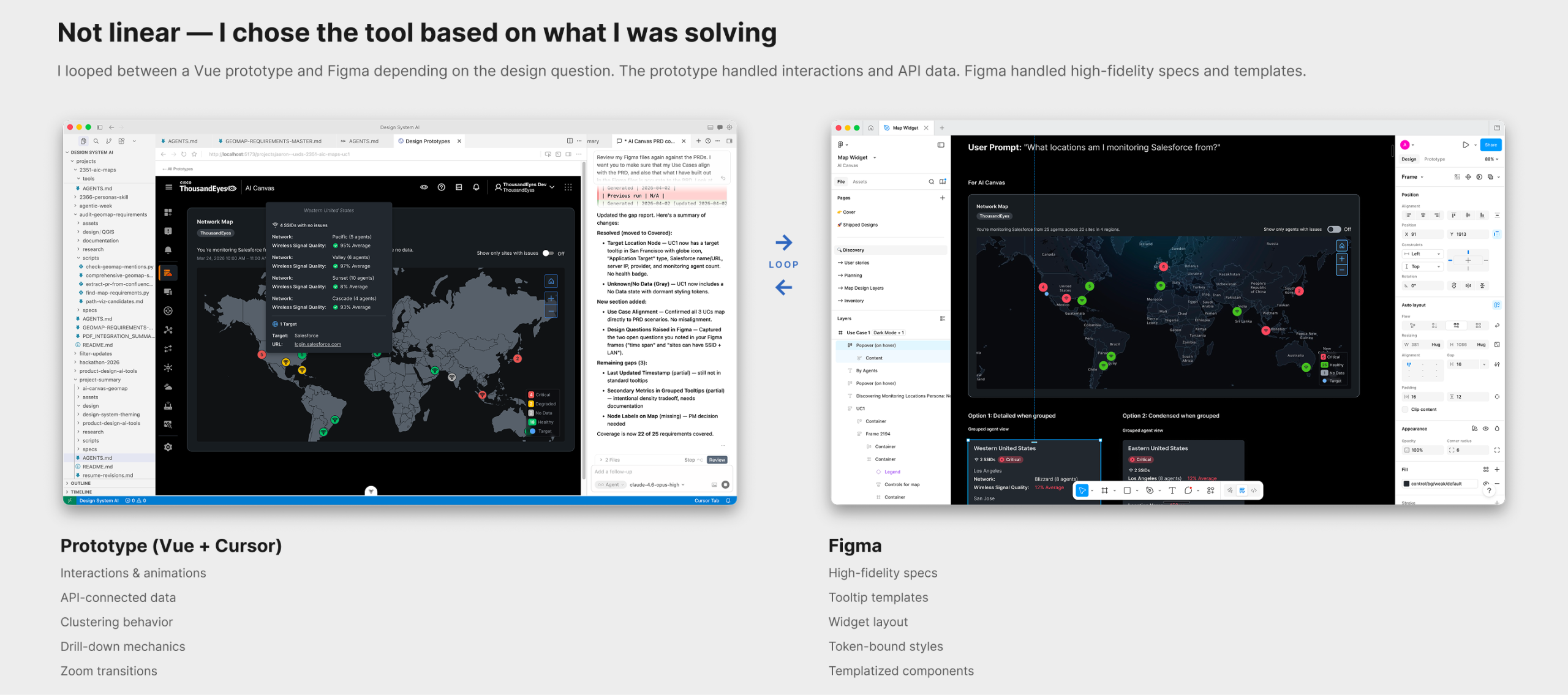
The design process wasn’t linear. I worked between a Vue prototype and Figma, looping back depending on what I was solving. The prototype handled interactions, API-connected data, and things that needed to move — clustering behavior, zoom transitions, drill-down mechanics. Figma handled high-fidelity specs, tooltip templates, and widget templatization where precision mattered.
AI as collaborator, not decision-maker. AI was a collaborator throughout, but the decisions were mine. When defining drill-down behavior and node color logic, AI generated options — but the decision that a single-issue node should be red (not amber, not a warning state) came from human judgment about how network engineers interpret severity at a glance. The pattern held across the project: AI proposed options and surface-area; I made the call.
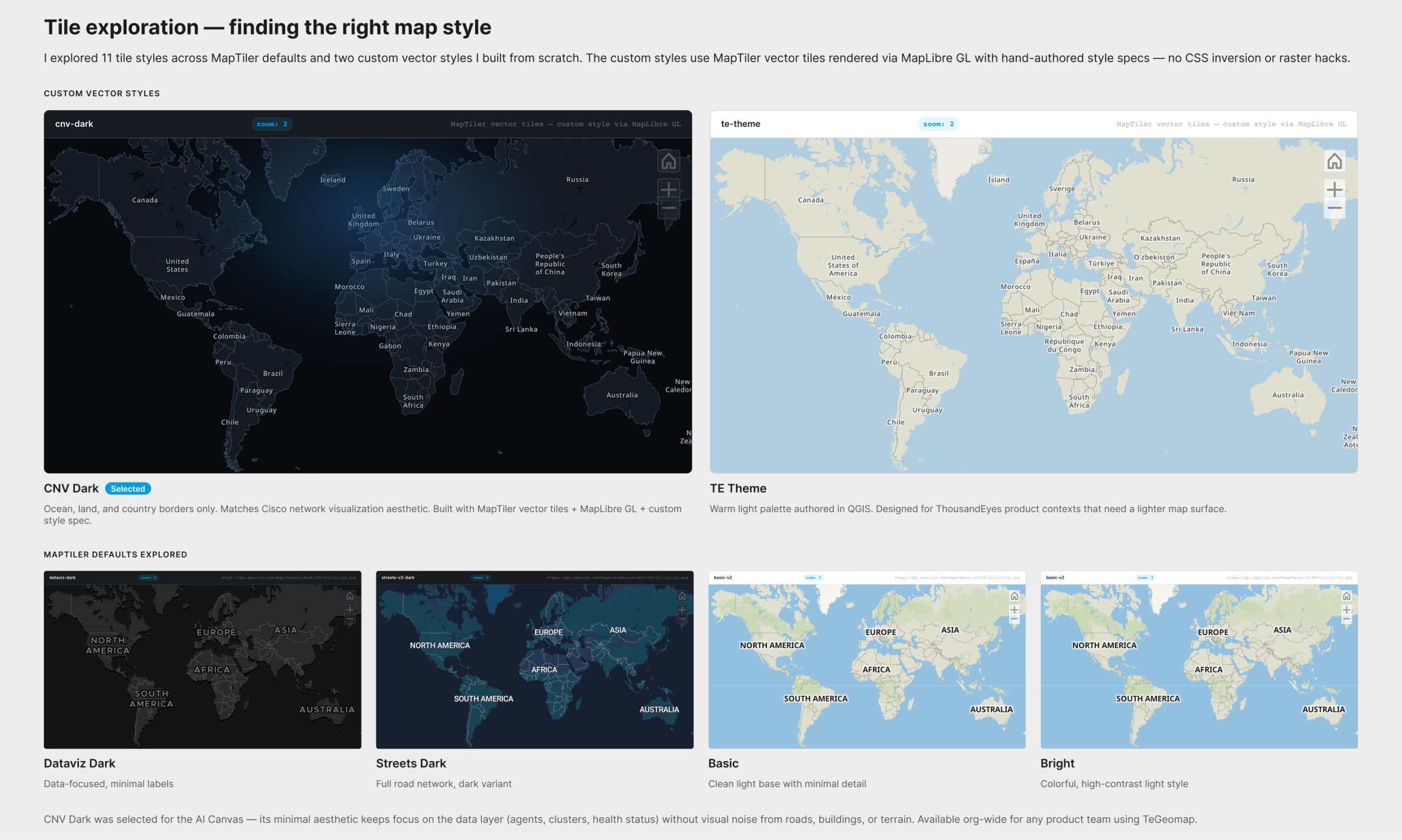
Map tile exploration. For the map tiles, I explored 11 styles — custom vector styles authored from scratch alongside MapTiler defaults — to find the right visual surface for network data. I evaluated them across three tools: QGIS for geographic data, MapTiler Cloud for style configuration, and directly in Cursor with a MapLibre GL prototype. Two custom styles emerged: CNV Dark (minimal ocean/land/borders, matching Cisco’s network visualization aesthetic) and TE Theme (a warm light palette for ThousandEyes product contexts). CNV Dark was selected for the AI Canvas — its minimal aesthetic keeps agents, clusters, and health status in focus without visual noise. Both styles are available org-wide.
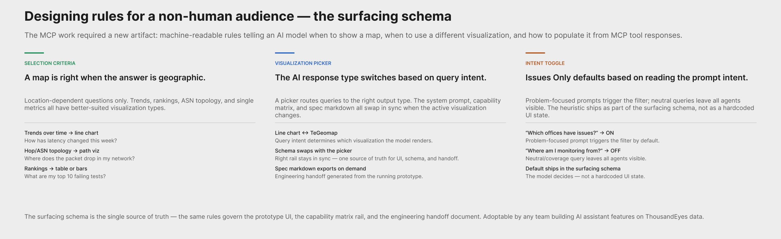
Surfacing schema design. The MCP work required a design artifact with no direct analog in traditional product design: a machine-readable spec that tells an LLM when a map is the right answer.
I authored geomapSurfacingSystemPrompt.js — a system prompt / schema that defines:
- When to show a map: location-dependent answers (coverage, regional health, spatial clustering, scoping by region)
- When not to: trends → line chart; hop/ASN topology → path visualization; top-N rankings → table or bar chart; single KPI → KPI card; non-geographic categories → bars/table
- Guardrail: never map without geocodable points and a clear geographic question
- “One map, one story” units policy: one entity type, one health encoding per map — prevents mixed-entity confusion
- Tool catalog: which ThousandEyes MCP tools return geocodable data directly (
list_cloud_enterprise_agents,list_endpoint_agents,search_outages) vs. which need a join to agents first (list_alerts,list_events,list_network_app_synthetics_tests) - “Issues only” toggle heuristic: default ON when the prompt is problem-focused (“which offices have issues?”, outage queries); OFF for neutral/overview prompts (“where am I monitoring from?”)
The schema is the single source of truth for the prototype, the capability matrix rail UI, and the engineering handoff. It can be adopted by any team building AI assistant features on top of ThousandEyes data.
I also designed the visualization picker — a multi-modality pattern where the AI assistant switches its response type (line chart ↔ TeGeomap) based on query intent, with the right-rail system prompt and capability matrix updating in sync.
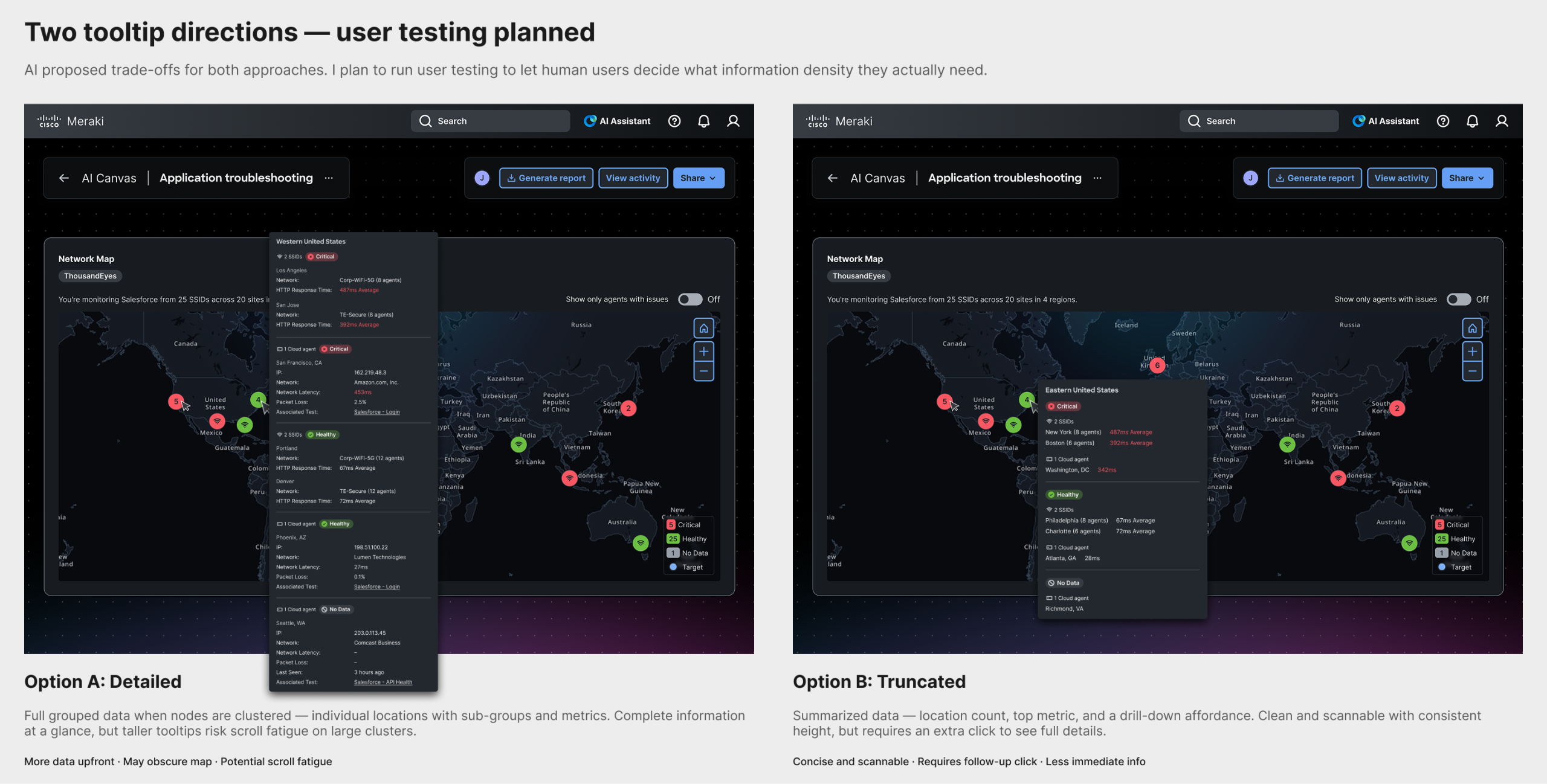
Tooltip exploration. Two tooltip directions were explored: one with detailed grouped data when nodes are clustered (risks scroll fatigue), and one with truncated summaries. I consulted AI on trade-offs; user testing will determine what information density users actually need.
Validate
The MCP prototype is complete and in engineering review on the Design-for-MCP-App branch, with a spec markdown export for handoff. The open validation thread is tooltip information density — a planned user test comparing the grouped vs. truncated options.
My Role
- Initiated the persona-based use case approach — translating PRD requirements into three distinct user scenarios that shaped the design
- Authored the surfacing schema — a machine-readable spec defining when the AI model should choose a map, what guardrails apply, how to populate it from MCP tool responses, and which tools require a data join
- Designed the visualization picker — a multi-modality pattern for AI assistant responses that switch between chart and map based on query intent, with schema and UI staying in sync
- Made key design decisions by evaluating AI-generated options through human judgment — drill-down hierarchy, node color logic, clustering behavior, intent-based toggle defaults
- Designed across two tools for different purposes — prototype for interactions and API access, Figma for high-fidelity specs and templates
- Explored 11 map tile styles across QGIS, MapTiler, and Cursor prototypes — authored two custom vector styles (CNV Dark and TE Theme), selected CNV Dark for the AI Canvas, both now available org-wide
- Delivered a working MCP prototype to engineering — running prototype with spec markdown export on the
Design-for-MCP-Appbranch
Outcome & Impact
- A map widget for the AI Canvas that answers location-based monitoring questions, with three node types, clustering, and contextual tooltips
- A working MCP prototype in engineering review — a fully specified, running version of the map widget sized for AI IDE shells (SM/MD/LG), with tier-aware zoom behavior
- A surfacing schema that defines the AI model’s selection rules for geographic visualization — the first machine-readable visualization decision spec in the org, adoptable by any team building on ThousandEyes AI features
- A spec markdown handoff document exportable directly from the prototype, keeping the schema, UI, and engineering implementation in sync
- Custom dark-mode map tiles (CNV Dark and TE Theme) available for any product team using TeGeomap
Reflection
What I learned. The MCP work surfaced a design problem with no analog in traditional product design: writing instructions for a non-human agent. When designing for a human, you design the surface and trust that the user will interpret it. When designing for an AI model, you design the rules the model follows to decide whether to show the surface at all — and those rules are themselves a design artifact. The constraints are different (no hover, no progressive disclosure, no re-render on scroll, no spatial memory between sessions) and require a different design vocabulary. Designing the rules of an AI output turned out to be as consequential as designing the output itself.
What I’d do differently. I would have started the tile exploration earlier. The custom dark tiles became a dependency for the Figma specs, and running the two workstreams closer to sequentially (tiles first, then widget) would have reduced context-switching. Similarly, the surfacing schema should have been started at the same time as the widget — the tool catalog constraints shaped what questions the map can actually answer, and discovering that late required revisiting scope.
How this informs future work. Every AI-delivered visualization needs a surfacing schema — a set of selection rules that a model can follow. The map is the first. The pattern (decision rules → guardrails → tool catalog → units policy → intent-based defaults) is reusable for any visualization type the design system adds to the AI Assistant. This project establishes what that work looks like.